LOGO
COLOR
TYPOGRAPHY
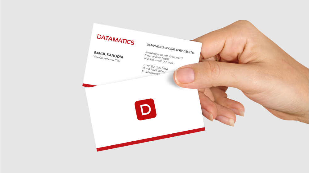
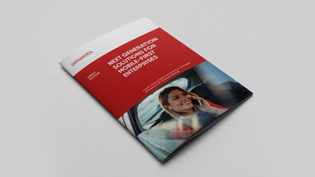
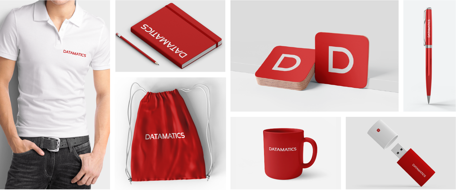
APPLICATION
PARTNER BRANDING
Get in Touch
LOGO
COLOR
TYPOGRAPHY
APPLICATION
PARTNER BRANDING
Get in Touch