Dextara Digital Brand Guidelines
Dextara Digital, now part of Datamatics, has updated its logo to reflect this new synergy. The new logo incorporates Datamatics' distinctive red color and font, along with the Datamatics logo, symbolizing the unified brand identity of Dextara Digital and Datamatics.
We have two logos: a Primary Logo and a Responsive Logo. The Primary Logo maintains continuity with the original Dextara Digital logo while integrating elements of the Datamatics brand. Both logos are minimalistic, vibrant with Datamatics' core red color, and represent the strong synergy between Dextara and Datamatics.
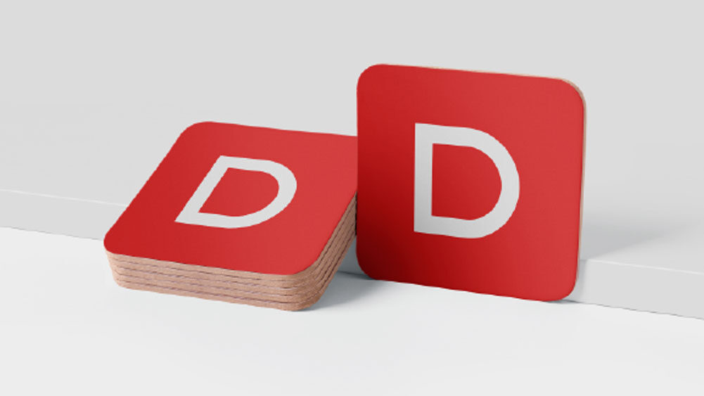
In today’s digital world with varying screen sizes, logos can no longer be “one size fits all.” Therefore, the Responsive Logo will be used in place of the Primary Logo when space is limited, such as on mobile screens or favicons. This logo retains the key elements of our brand: the 'D' from Datamatics and the signature Datamatics red color.
To ensure proper recognition of the Dextara Digital brand, every reproduction of the logos must be clear, crisp, and undistorted.
The proportion of the Primary Logo is 7.75 : 2.65. This means if the height of the 'D' in Datamatics is x, then the height of the Primary Logo is 2.65x and width of the Logo is 7.75x.
The proportion of the Responsive Logo is 1 : 1. This means the height of the Responsive Logo is equal to its width.

In order to ensure the prominence and legibility of the Logos, a clear space around the Logos is required at all times. If the height of the 'D' in Datamatics logo equals x, then the space on all the four sides of the Primary and Responsive Logos is 1x. The line surrounding the identity shown indicates the clear space and is not meant to be printed.

The minimum size for the Primary Logo in print is 20 mm (width) and the minimum size for the Responsive Logo in print is 5 mm. Both the Logos are scalable and there is no limit to the maximum size.
The minimum size for the Primary Logo in digital is 80 px and the minimum size for the Responsive Logo in digital is 15 px. Both the Logos are scalable and there is no limit to the maximum size.
The Responsive Logo has to be used as a substitute to the Primary Logo for print as well as digital wherever there is space constraint and usage of the Primary Logo is not advisable (less than 20mm in print or 80px in digital).

The Primary Logo of Dextara with Datamatics in Red should be on a white background. Apart from this, a black Logo on a white background or a white Logo on a black background can also be used. The Responsive Logo in Datamatics Red should be used on a white background, and a white Responsive Logo should be used on a black background.

It is crucial that the Logos are always used correctly, and not misused in any way. This will ensure a consistent look across all Dextara brand applications. On the right-hand side are examples of what to avoid while using the Dextara Logos.

Our primary brand colors are Datamatics RED, WHITE, and BLACK. They are used to provide accessibility, simplicity, and consistency throughout all the brand communications.

Besides the primary color palette, there is a secondary color palette that can be used where additional colors may be required. They should be used sparingly to maintain meaning and potency.

Gilroy is a typeface that is inspired by geometric lettering bringing freshness and clarity to our communication. It is modern, contemporary and versatile. The entire font family has been designed with expansive weights, which work beautifully across all mediums, from headlines to body text.
Gilroy will be used primarily for print (creatives, collaterals, stationery, etc) and website.


Segoe UI is a system font that is pre-installed on PCs for internal usage. It will be used for emails, bodycopy of documents and presentations.


For more information write to corp.communication@datamatics.com